Creating Context Menus for Apps
To enable the user to configure a state machine in Desk a context menu is defined, which leads the user step-by-step through the configuration. Those context menus can be implemented using HTML5, CSS3 and JavaScript. To support dynamic markup, KnockoutJS with its data binding and component system is utilized. The basics about employed mechanisms like binding handlers and the binding context can be found in the knockout documentation.
To attach a context menu to an App, the contextMenu field of the App's
clientData has to be set. Any HTML markup in this clientData field will
then be rendered as a context menu in Desk. Context menus are mainly navigable
via the pilot-buttons on the robot, i. e. cross, circle, check and
arrow-buttons in four directions. Navigation via mouse/keyboard and touch on a
tablet computer is also possible.
Steps divide the process of configuring a state machine in small chunks. Steps are combined in a tree like structure. The following code-block depicts a basic step.
<step id="id"></step>
A step needs to have an [id], but more attributes can be provided (see
Step API).
Note
All step ids - except for the top level steps - get postfixed
with a consecutive number, e.g. pick-pose-0. This has to be taken into
account when referring to a step via its id, e.g. for styling purposes.
Note
Use only classes for CSS styling. [style] attributes and
[id] selectors should be avoided. This ensures that the context menu API can
adapt the styling correctly to a common look (due to selector specifity).
The first level of steps - so called top level steps - are
rendered as tabs of the context menu and are navigable via check and
cross.
A top level step can contain further steps - so called sub steps. If a top level
step is focused, its sub steps are recursively focused until the first leaf step
is reached. Inside a top level step navigation is possible via the
arrow-buttons, where right and down focus the next leaf step and
left and up focus the previous leaf step. However, it is possible to
override this behavior if needed (see Customizing Pilot Navigation)
When creating a context menu, we first have to define the top level steps (i.e. divide the parameters to be configured into meaningful chunks). A good strategy is to cover all the parameters which can be taught via guiding in the beginning, such as robot poses and gripper widths.
For our Tutorial App, we have to parameterize the approach and retract
poses along with the gripper width for the opened and closed gripper. For
picking the object, the parameters are set in a step with the id
#pick-motion. A step with the id #place-motion is added for placing the
object. Furthermore, the collision area and the velocity have to be
parameterized. The structure of our context menu for the Tutorial App will
therefore look like this:
contextMenu : @{
  <step id="pick-motion"></step>
  <step id="place-motion"></step>
  <step id="collision"></step>
  <step id="velocity"></step>
}@;
The following image depicts the context menu we want to create for our
Tutorial App. The just defined top level steps are visible above the
content area.
Parameter Modification
Parameters of the surrounding state machine are accessible via parameter().
To access only a subtree of the parameter, an expression has to be provided.
parameter('velocity') accesses e.g. the velocity parameter in the
Tutorial App, parameter('pick_pose.joint_angles') the joint angles
of the pick pose. Sometimes, numerical values are internally handled in a unit
which is not comfortable to modify for the user. Therefore several modifiers
are provided for the parameters, which enable conversion. Those modifiers are
add, multiply and round. To convert e.g. a temperature from degree
Celsius to degree Fahrenheit with one decimal place, one would write
parameter('temperature').add(-32).multiply(5/9).round(1)
To enable the user to modify the parameters, a variety of input components is
provided. Numerical values can be modified via sliders. Choosing between two or
more options is enabled via checkbox-slider, alternative-selector and
drop-down-menu. One or several poses can be taught via robot-pose and
robot-pose-carousel, respectively. Teaching the gripper-width isolated from
the pose is obtained with gripper-control. Components are used as follows:
<component-name params="
  ...
  step: step
"/>
Each component has specific parameters, which have to be passed to the [params]
attribute.
Note
The components require you to also pass the step from the
binding context into the component. This is necessary to allow for pilot
navigation and correct visualization on acquiring focus.
Linear slider
Allows for setting a value within a range
Parameters
value[mandatory] (Number): the App parameter which should be modifiedmax[mandatory] (Number): the maximal valuemin[default=0] (Number): the minimal valueincrement[default=1] (Number): the amount by which the value is increased or decreased by pressing the arrow buttons or dragging the slider knobinitial[default=min] (Number): the initial valueunit(String or Array[String]): the unit of the parameter, either as a single string, e.g.'%'or as an array of strings, e.g.['second', 'seconds'], where the first entry is displayed if the value is1and the last entry otherwise
Code Example
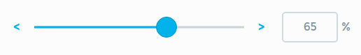
<linear-slider params="
  value: parameter('velocity'),
  initial: 65,
  increment: 5,
  max: 100,
  unit: '%',
  step: step
"/>
Toggle slider
Allows for modifying several numerical values at once.
Parameters
An array is passed to the toggle-slider which contains the parameters for
all linear-slider inside, as listed in Linear slider, plus an
additional label parameter, which is displayed in the button bar on the
left.
Code Example
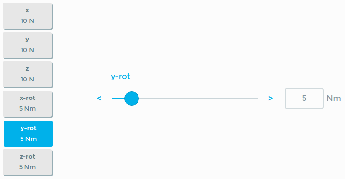
<toggle-slider params="
  parameters: [
    {value: parameter('safety.force_thresholds.x'), label: 'x', min: 3, max: 100, unit: 'N'},
    {value: parameter('safety.force_thresholds.y'), label: 'y', min: 3, max: 100, unit: 'N'},
    {value: parameter('safety.force_thresholds.z'), label: 'z', min: 3, max: 100, unit: 'N'},
    {value: parameter('safety.force_thresholds.x_rot'), label: 'x-rot', min: 1, max: 30, unit: 'Nm'},
    {value: parameter('safety.force_thresholds.y_rot'), label: 'y-rot', min: 1, max: 30, unit: 'Nm'},
    {value: parameter('safety.force_thresholds.z_rot'), label: 'z-rot', min: 1, max: 30, unit: 'Nm'},
  ],
  step: step
"/>
Arc slider
Allows for a circular representation of the value space.
Parameters
value[mandatory] (Number): the App parameter which should be modifiedmin[default=0] (Number): the minimal valuemax[default=Infinity] (Number): the maximal valueincrement[default=1] (Number): the amount by which the value is increased or decreasedzeroValue[default=0] (Number): the start of a circlefullValue[default=360] (Number): the end of a circleinitial[default=min] (Number): the initial valueunit(String or Array[String]): the unit of the parameter, either as a single string, e.g.'%'or as an array of strings, e.g.['second', 'seconds'], where the first entry is displayed if the value is1and the last entry otherwise
Code Example
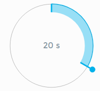
<arc-slider params="
  value: parameter('duration'),
  initial: 20,
  fullValue: 60,
  unit: 's',
  step: step
"/>
Checkbox Slider
Allows for modifying booleans.
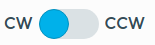
Parameters
value[mandatory] (Boolean): the App parameter which should be modifiedunchecked[default='OFF'] (String): a string displayed on the left side of thecheckbox-sliderchecked[default='ON'] (String): a string displayed on the right side of thecheckbox-slider
Code Example
<checkbox-slider params="
  value: parameter('clockwise'),
  unchecked: 'CW',
  checked: 'CCW',
  step: step
"></checkbox-slider>
Alternative Selector
Allows for choosing between multiple values which are displayed as an image with a label.
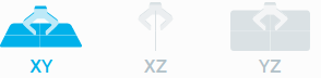
Parameters
parameter[mandatory] (String): the App parameter which should be modifiedalternatives(Array[Object]): an array of alternative objects, defined byname(String): the displayed name of the alternativeimage(String): an image displayed above the namevalue[mandatory] (String): the value which is written intoparameterwhen the corresponding alternative is selected
Code Example
<alternative-selector params="
  parameter: parameter('velocity_profile.plane'),
  alternatives: [
    { name: 'XY', image: plane_xy, value: 'xy' },
    { name: 'XZ', image: plane_xz, value: 'xz' },
    { name: 'YZ', image: plane_yz, value: 'yz' }
  ],
  step: step
"></alternative-selector>
Drop Down Menu
Allows for choosing between multiple values.
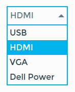
Parameters
parameter[mandatory] (String): the App parameter which should be modifieditems[mandatory] (Array[Object]): an array of item objects, defined byvalue[mandatory] (String): the value which is written intoparameterwhen the corresponding item is selectedtext(String): the displayed name of the item
default(String): the value of the item selected by default
Code Example
<drop-down-menu params="
  parameter: parameter('plug_type'),
  default: 'hdmi',
  items: [ {value: 'USB', text: 'USB'},
            {value: 'hdmi', text: 'HDMI'},
            {value: 'VGA', text: 'VGA'},
            {value: 'dellPower', text: 'Dell Power'},
          ],
  step: step
"></drop-down-menu>
Robot Pose
Allows for writing the current pose of the robot into a parameter. This component
allows to simultaneously write the gripper width by passing a parameter to
gripper_open or gripper_closed. Can be used to teach a single pose or
multiple related poses. If multiple related poses are taught, one of the poses
has to be marked as reference.
Markup passed to the component will be rendered inside the context menu to represent the pose. Refer to Visualizing Robot Poses for a detailed description to proper visualization.
Parameters
Note
Besides the step also the path and the componentProviderApi has to be passed from the binding context.
pose[mandatory] (Object): the App parameter which should be modifiedgripper_open(Object): if passed an App parameter, it will be written simultaneously with the posegripper_closed(Object): if passed an App parameter, it will be written simultaneously with the poseisRelativeToFirst(Boolean): refer to Robot Poses in pattern and points for a detailed descriptionisBottomRightFirst(Boolean): refer to Robot Poses in pattern and points for a detailed description
If more than one robot pose is used:
reference(Boolean): set to true, if this is the pose which requires the most accuracy, e.g. if there is an approach pose and a pick pose, set true for the pick poserelatedPoses(Object(Object)): contains all related poses with the id of the step as key and the parameter as value
Code example
<robot-pose params="
  pose: parameter('pick_pose'),
  reference: true,
  isBottomRightFirst: false,
  relatedPoses: {
    'pick-pose': parameter('pick_pose'),
    'approach-pose': parameter('pick_approach')
  },
  step: step,
  path: path,
  componentProviderAPI: componentProviderAPI
">
  <div class="pose-content">
    ...
  </div>
</robot-pose>
Robot Pose Carousel
Allows for teaching an arbitrary amount of poses.
Displays the first and last pose, when not editing.
Parameters
poses[mandatory] (Array[Object]): the App parameter which should be modifiedrelatedPoses(Object[Object]):
Code Example
<robot-pose-carousel params="
  poses: parameter('motion'),
  relatedPoses: {
    points: parameter('motion'),
  },
  step: step,
  path: path,
"></robot-pose-carousel>
Gripper Control
Allows for teaching the gripper width independent from the pose. It displays the actual gripper width (grey indicator) and the current set width (blue indicator) and enables the user to adopt the current value.

Parameters
width[mandatory] (Number): the App parameter which should be modified
Code Example
<gripper-control params="
  width: parameter('gripper_open_width'),
  step: step
"></gripper-control>
Example
We can now fill our top level steps in the Tutorial App with components,
to configure the needed parameters. Even though it is possible to teach pose and
gripper width at the same time, it is recommended to add separate steps, because
it leads the user better and facilitates reteaching of poses or gripper widths
separately. We add four steps to the #pick-motion top level step with one
component each, i.e. two robot-pose and two gripper-control components
to configure the approach/retract and the pick pose.
As the gripper_open_width and gripper_closed_width are known from the
#pick-motion, only two robot-poses are added to #place-motion.
To configure the collision area and the velocity a toggle-slider and a
linear-slider are added. The first enables the user to define values between
1 and 20 centimeters for x, y and z. The velocity can be modified in
relation to the overall robot velocity, which is set in the timeline context
menu.
<step id="pick-motion">
  <step id="pick-approach">
    <robot-pose params="
      pose: parameter('pick_approach'),
      relatedPoses: {
        'pick-pose': parameter('pick_pose'),
        'pick_approach': parameter('pick_approach')
      },
      step: step,
      path: path,
      componentProviderAPI: componentProviderAPI
    "></robot-pose>
  </step>
  <step id="approach-width">
    <gripper-control params="
      width: parameter('gripper_open_width'),
      step: step
    "></gripper-control>
  </step>
  <step id="pick-pose">
    <robot-pose params="
      pose: parameter('pick_pose'),
      relatedPoses: {
        'pick-pose': parameter('pick_pose'),
        'pick-approach': parameter('pick_approach')
      },
      step: step,
      path: path,
      componentProviderAPI: componentProviderAPI
    "></robot-pose>
  </step>
  <step id="pick-width">
    <gripper-control params="
      width: parameter('gripper_closed_width'),
      step: step
    "></gripper-control>
  </step>
</step>
<step id="place-motion">
  <step id="place-approach">
    <robot-pose params="
      pose: parameter('place_approach'),
      relatedPoses: {
        'place-pose': parameter('place'),
        'place-approach': parameter('place_approach')
      },
      step: step,
      path: path,
      componentProviderAPI: componentProviderAPI
    "></robot-pose>
  </step>
  <step id="place-pose">
    <robot-pose params="
      pose: parameter('place_pose'),
      relatedPoses: {
        'place-pose': parameter('place'),
        'place-approach': parameter('place_approach')
      },
      step: step,
      path: path,
      componentProviderAPI: componentProviderAPI
    "></robot-pose>
  </step>
</step>
<step id="collision">
  <toggle-slider params="
    parameters: [
      {value: parameter('contact.x').multiply(100).round(), label: 'Offset x', min: 0, max: 20, unit: 'cm'},
      {value: parameter('contact.y').multiply(100).round(), label: 'Offset y', min: 0, max: 20, unit: 'cm'},
      {value: parameter('contact.z').multiply(100).round(), label: 'Offset z', min: 0, max: 20, unit: 'cm'}
    ],
    step: step
  "/>
</step>
<step id="velocity">
  <linear-slider params="
    value: parameter('velocity').multiply(100),
    min: 5, max: 100, increment: 5,
    unit: '%',
    step: step
  "/>
</step>
Visualizing Robot Poses
Typically, Apps demand for teaching several related poses. These poses should be
depicted in a scene, which represents the poses in relation to the workspace.
Suitable images have to be passed to the robot-pose component, such that the
current teaching situation is visualized in the context menu. Markup passed to
the component will be rendered inside the context menu to represent the pose.
Typically it consists of one or more wrapped up SVG images.
Note
The markup passed to the robot-pose has to be sized properly, such that other elements inside the context-menu will not be overlapped by the overflow of the element's box.
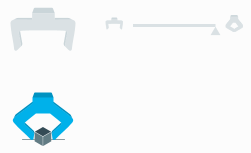
For our #pick_pose we want to display the gripper grasping an object as
depicted in the following image, consisting of an SVG image of the gripper and
an SVG image of the object (see Guidelines for SVG Images).
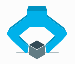
Both SVG images are passed to the robot-pose.
<robot-pose params="...">
  <svg><use href="object.svg#icon"></svg>
  <svg><use href="gripper_opened.svg#icon"></svg>
</robot-pose>
Positioning
There are several classes provided to arrange the passed markup, i.e.
|
|
|
|
|
|
|
|
|
As we have two elements, we arrange them centered at the top and bottom.
<robot-pose>
  <div class="pose-content" style="width: 80px; height: 100px">
    <svg class="center-top"><use href="object.svg#icon"></svg>
    <svg class="center-bottom"><use href="gripper_opened.svg#icon"></svg>
  </div>
</robot-pose>
Notice that we added a .pose-content wrapper around the SVGs. The classes
provided above add position: absolute to the elements such that they do not
influence the size of the surrounding container. We therefore define width
and height on the .pose-content.
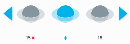
Coloring and Visibility
The coloring and visibility of the pose-content depends on the current focus.
The content of leaf steps which prior siblings are not configured is hidden.
This behavior can be customized by adding the classes .visible or
.hidden to elements.
There are three color schemes
light-gray: default for focusable but not focused stepsdark-grayhighlighted: default for focused steps
as depicted in the following image from left to right.

To adjust the appearance of elements inside a focused step the classes
.light-gray or .dark-gray can be added. To enforce a certain color
scheme no matter if the step is focused or not, the color classes can be
prefixed with static-, i.e. .static-highlighted.
For the #pick-pose, we want the object to be visible all the time in a neutral
color. Therefore the classes .visible as well as .static-dark-gray are added.
<robot-pose>
  <div class="pose-content">
    <svg class="center-top"><use href="object.svg#icon"></svg>
    <svg class="center-bottom static-dark-gray visible">
      <use href="gripper_opened.svg#icon">
    </svg>
  </div>
</robot-pose>
Guidelines for SVG Images
To get good looking results, the SVG images have to fulfill certain
prerequisites. To address the SVG image like in the example above, an [id]
has to be set. It is recommended to remove all [height] or [width]
attributes from the SVG image and provide only a [viewbox]. Sizing of the
SVG images should take place inside the App, e.g. by adding a <style>-tag or
[style]-attribute. Furthermore, inside the SVG image no colors should be
set, as the color schemes above would be overwritten. If unintended outlines or
lines are visible in the SVG image, it is recommended to set [stroke] as
"none". If those prerequisites are fulfilled, the SVG will be displayed in
the primary color of the color scheme. To add depth to the image by coloring
certain areas darker, fill="currentColor" has to be set.
The depicted gripper image has for example the following structure
<svg id="icon" xmlns="http://www.w3.org/2000/svg" stroke="none" viewBox="0 0 123.65 81.91">
    <g id="gripper-front">
        <path id=".." d="..."/>
    </g>
    <g id="gripper-back" fill="currentColor">
        <path id=".." d="..."/>
        <path id=".." d="..."/>
        <path id=".." d="..."/>
        <path id=".." d="..."/>
        <path id=".." d="..."/>
    </g>
</svg>
SVGs can be used inside the context menu via
<svg><use href="bundles/tutorial/gripper.svg#icon"></use></svg>
The link to the image assumes, that it is placed within a resources folder
inside the tutorial bundle.
Important note: the <svg> tag within the SVG file requires an [id]
attribute to be addressable. This [id] then has to be appended to the URL
with a #, like in the example above.
Download gripper_opened.svg, gripper_holding.svg and object.svg
and place them inside tutorial/resources:
.
└── bundles
  └── tutorial
      ├── resources
      │  ├── logo.svg
      │  ├── gripper_holding.svg
      │  ├── gripper_opened.svg
      │  └── object.svg
      ├── sources
      │  └── Tutorial.lf
      └── manifest.json
Positioning and Spacing of Steps
Finally, the steps themselves have to be arranged to depict the workspace. The positioning via the CSS Flexbox Layout can be achieved by using
.flex-column.flex-row
either on the steps or surrounding containers. Those classes can be extended by
.center-content-x.center-content-y
to achieve vertical and horizontal alignment respectively.
Another convenient way for positioning is the CSS Grid Layout, as it enables two-dimensional arrangement of the content.
A convenient way to modify the spacing via margins is by using the classes
.margin-top-.margin-bottom-.margin-left-.margin-top-
postfixed with the margin in pixels. The classes are available for margins from
20 to 300 pixels in 20 pixel increments, e.g. .margin-top-40 or
.margin-left-280.
For the Tutorial App we add .flex-column to the #pick-motion step,
which contains two containers with the #pick-approach and
#approach-width and the #pick-pose and #pick-width respectively.
Both containers have the .flex-row class. As now all components are close
together, we add .margin-bottom-60 to the first container and
.margin-right-60 to the #pick-approach and #pick-pose steps.
The #pick-motion step looks now like this.
<step id="pick-motion" name="Pick Motion" class="flex-column">
  <div class="flex-row margin-bottom-60">
    <step id="pick-approach" class="margin-right-60">
      <robot-pose params="...">
        <div class="pose-content">
          <svg class="center-top"><use href="gripper_opened.svg#icon"></use></svg>
        </div>
      </robot-pose>
    </step>
    <step id="approach-width">
      <gripper-control params="..."></gripper-control>
    </step>
  </div>
  <div class="flex-row">
    <step id="pick-pose" class="margin-right-60">
      <robot-pose params="...">
        <div class="pose-content">
          <svg class="center-bottom static-dark-gray visible">
            <use href="object.svg#icon"></use>
          </svg>
          <svg class="center-top">
            <use href="gripper_holding.svg#icon"></use>
          </svg>
        </div>
      </robot-pose>
    </step>
    <step id="pick-width">
        <gripper-control params="..."></gripper-control>
    </step>
  </div>
</step>
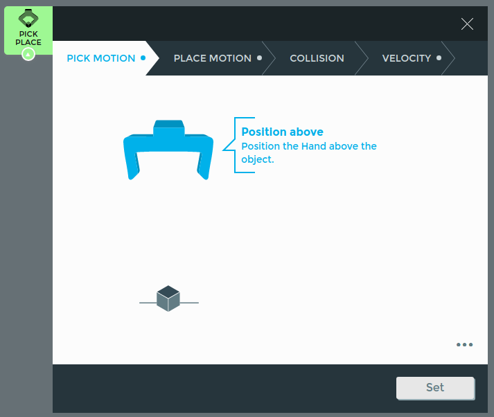
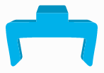
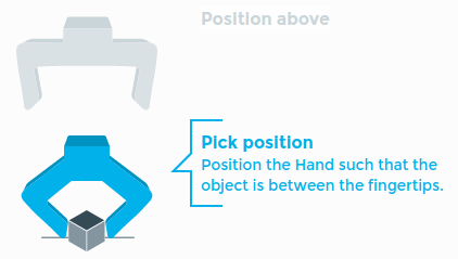
If the context menu of the App is opened for the first time, the following scene is visible to the user
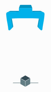
After teaching the approach pose and approach width, the scene changes to the following image.
Providing Descriptions
Providing only images is in most cases not sufficient to guide the user through
the teaching process. Therefore it is possible to add a [name] and a [label]
attribute to steps, which provide textual information to the user. The name
shortly titles the step, whereas the label provides one or more sentences to
describe the step in more detail. The names of the top level steps are visible
all the time as the titles of the tabs at the top of the context menu.
robot-pose, robot-pose-carousel and gripper-control provide
step-labels, which display title and label of the surrounding step. If a
step is focusable - i.e. all previous steps are configured - the content of the
step and its name are visible. If focused, the name as well as the label are
visible next to the step as depicted in the following image
Step labels can also be added manually by placing <step-label params="step:
step" /> inside a step. Step labels appear by default on the right side of the
step. By adding the class .left to the step-label or .left-step-label to
the step, the step-label will be moved to the left side.
We therefore extend our #motion step with names and labels.
<step id="pick-motion" name="Pick Motion">
  <step
    id="pick-approach"
    name="Position above"
    label="Position the Hand above the object."
  >...</step>
  <step
    id="approach-width"
    name="Open fingers"
    label="Set the width between the fingertips such that it is larger than the object at its picking points."
  >...</step>
  <step
    id="pick-pose"
    name="Pick position"
    label="Position the Hand such that the object is between the fingertips."
  >...</step>
  <step
    id="pick-width"
    name="Close fingers"
    label="Close the fingers such that the object is firmly grasped."
  >...</step>
</step>
Furthermore it is possible to add descriptions via the html elements h1,
h2 and p or label. We add <h2/> with the step label to add a
description to the linear-sliders in the #collision and #velocity step.
<step
id="collision"
name="Collision Area"
class="flex-column"
label="Set the collision area in which a collision should be detected."
>
<h2 data-bind="text: step.label"/>
<linear-slider params="..."/>
</step>
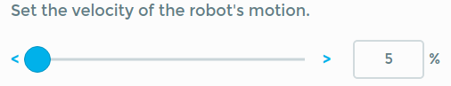
<step
id="velocity"
name="Velocity"
class="flex-column"
label="Set the velocity of the robot's motion."
>
<h2 data-bind="text: step.label"/>
<linear-slider params="..."/>
</step>
The resulting #velocity step can be seen in the following image
Putting it all together
See the full version of the file here.
Advanced Topics
Step API
Conditional Steps
Sometimes, steps should only be available, if certain prerequisites are
fulfilled. This can be obtained by setting the [if] attribute of the step,
e.g.
contextMenu : @{
  <step id="..." if="parameter('show_step')() == true">...</step>
}@;
Initial
To specify a different entry point when focusing a step, add [initial] to one of
its children:
<step id="..." initial></step>
Configured
Steps which need no more intervention by the user are configured. A step can
only be configured if all of its children are configured as well. Not yet
configured top level steps are marked in the context menu. In general, the
configured handling is enforced by the components, which check if the passed
parameter is still nil. The configured handling can be customized by adding
the [configured] attribute to the step.
<step id="..." configured="parameter('configured')() == true" ></step>
Light-weight viewmodels
The light-weight viewmodel mechanism can be used to inject a custom viewmodel
into a step. This allows to hold values in lexical scope, provide a cleaner
interface to the markup / binding handlers while retaining access on the full
binding context (with which the <viewmodel> content is invoked):
<step id="repetitions" label="Repetitions" configured="parameter('times')">
  <viewmodel>
    var ko = require("knockout")
    var value = parameter('times')

    var element = $element
    element.addEventListener("blur", function() {
      value(element.value)
    })

    return ko.pureComputed(function() {
      return value() + " times"
    })
  </viewmodel>
  <input type="number" data-bind="
    value: viewmodel,
    attr: { min: 1, max: 10, step: 1 }
  " />
  <div data-bind="text: viewmodel">
</step>
Custom Components
Creating Components
Components are declared using <component> tags in the components
clientData entry in the App.
A component has one or more names and consists of two parts: <template>
markup and <viewmodel> javascript code. The contents of these tags can be
either inlined or sourced from another file, e.g.:
components : @{
  <component name="custom-component also-custom-component">
    <template src="custom_component.html"></template>
    <script src="custom_component.js"></script>
  </component>
}@
This markup declares a new component available as custom-component and
also-custom-component. All component names are required to contain a dash.
Template
Whenever possible, it is recommended to use the introduced classes in
Positioning and Spacing of Steps. However, templates can contain <style> tags to style the
template elements accordingly. It is recommended to use the name of the
components inside the css rules to avoid leaking, as depicted in the following
code-block.
<style>
  custom-component input {
    width: 50px;
  }
</style>
To be able to style the component dependent on the current focus, the step class
.focused can be used, as depicted in the following code-block.
<style>
  step.focused custom-component {
    border-width: 2px;
  }
</style>
There are a number of variables for colors which get replaced to pre-defined values. It is recommended to use these over hardcoded values to have consistent styling. Those are
$error.color$warning.color$circle.color$check.color$cross.color
Similar to the highlighted color scheme
$focused.color$focusedAccent.color
Similar to the light-gray color scheme
$inactive.color$inactiveAccent.color$inactiveSubtle.color
Similar to the dark-gray color scheme
$active.color$activeAccent.color$activeSubtle.color
The following example template contains the HTML5 <input> element and a
button bound to the component's click method.
<template>
  <style>
    custom-component input {
      width: 50px;
    }
    step.focused custom-component {
      border-color: $focused.color;
    }
  </style>
  <input type="number" data-bind="
    value: value,
    attr: { min: min, max: max, step: increment }"/>
  <div data-bind="click: click">OK</div>
</template>
Viewmodel
The <viewmodel> tag is loaded as CommonJS module with a variety of
requirable modules. However, the code is loaded without context, so everything
has to be required. The declared exports or returned value is used as
constructor for the component viewmodel, so make sure you export or return a
function.
Requirable modules are
The viewmodel constructor is provided with (as in Knockout components) the
passed params and additional arguments:
api- The Desk API to play sound or retrieve robot posessource- The element API for the skill/group which declared the component. This is used to provide components which not only parameterize the instantiating but also the providing skill.element- A reference to the DOM element holding the rendered template.
The instance created by invoking the constructor with new will then be available
as $data and $component in the binding context.
var _ = require("lodash")

var NumberInput = function(params, api, source, element) {

  this.value = params.value
  this.min = params.min || 0
  this.max = params.max
  this.increment = params.increment || 1

  this.click = function() {
    params.step.done()
  }
}
Matrix
The module matrix provides several matrix utility functions for
transformation matrices, poses and trajectories. Transformation
matrices are stored in column-major order in arrays of
length 16. Poses are objects containing the transformation matrix and
the joint angles as an array of length 7, i.e. { pose: Array[16],
joint_angles: Array[7] }. Trajectories are arrays containing poses.
Matrix.transpose(m): transposes a matrixarguments:
m (Array)the matrix to processreturns:
(Array)the transposed matrix
Matrix.invert(m): inverts a matrixarguments:
m (Array)the matrix to processreturns:
(Array)the inverted matrix
Matrix.dot(m1, m2): multiplies two matricesarguments:
m1 (Array), m2 (Array)the matrices to processreturns:
(Array)the result of the multiplication
Matrix.identity(): returns a new identity matrixreturns:
(Array)identity matrix
Matrix.translate(m, x, y, z): translates the transformation matrixarguments:
m (Array)the transformation matrix,x (Number), y (Number), z (Number)translation vectorreturns:
(Array)the result of the translation
Matrix.moveTrajectory(traj, a, b): moves a trajectory from a to barguments:
traj (Array(Objects))the trajectory to be moved,a (Object), b (Object)the start (a) and end (b) pose asreturns:
(Array(Objects))the moved trajectory
Matrix.movePose(pose, a, b): moves a pose from a to barguments:
pose (Object)the pose to be moved,a (Object), b (Object)the start (a) and end (b) pose asreturns:
(Object)the moved trajectory
Matrix.matricesEqual(a, b, [p]): checks if two matrices are equal given a certain precisionarguments:
a (Array), b (Array)the matrices to be compared,p [optional] (Number)the precisionreturns:
(Boolean)returnstrueif matrices are equivalent
Matrix.trajectoriesEqual(a, b, [p]): checks if two trajectories are equal given a certain precisionarguments:
a (Array(Object)), b (Array(Object))the trajectories to be compared,p [optional] (Number)the precisionreturns:
(Boolean)returnstrueif trajectories are equivalent
Component Util
The module component_util provides several utility functions.
Util.or([args]): returns the first argument which is notundefinedornullarguments:
args (...)the arguments to check forundefinedandnullreturns:
(...)the first arguments which is notundefinedornull
Util.clamp(value, min, max): clamps value within the lower and upper boundsarguments:
value (Number)the value to clamp,min (Number)the lower bound,max (Number) the upper boundreturns:
(Number)the clamped value
Util.pluralize(unit, value): applies correct pluralization to unit, e.g."second"instead of"seconds"if the value is 1arguments:
unit (String or Array(String))the unit(s),value (Number)the current valuereturns:
(String)unit with correct number
Custom groups
You can create your own groups, similar to points and grid. A .lf file is recognized as a group when it defines type: "group" within the clientData.
The group can modify the behavior of child apps in many ways. One is by registering their own components like robot-pose and thus overwriting the default robot-pose:
components: @{
  <component name="robot-pose" linkable>
    <template src="custom_group/robot_pose.html"></template>
    <script src="custom_group/robot_pose.js"></script>
  </component>
}@;
The icons displayed on the left and right can be defined by adding two more svg
elements to the image clientData with the ids open and close.
clientData {
  ...
  image: @{
    <svg id="icon"><use href="bundles/custom_group/logo.svg#icon"></use></svg>
    <svg id="open"><use href="bundles/custom_group/open.svg#open"></use></svg>
    <svg id="close"><use href="bundles/custom_group/close.svg#close"></use></svg>
  }@;
}
Interaction
Interaction via Mouse
Interaction with components is only possible, if the surrounding step is
focused. To avoid the necessity to click twice on an element to first focus the
step and afterwards actually click the element, the class .clickable can be
added. Furthermore the class .pointer is provided, to change the cursor to a
pointer when hovering an element with named class.
Robot Poses in pattern and points
The points and pattern groups enable the execution of multiple similar
robot movements by teaching a reference pose multiple times. To use an App
within the groups, one of the poses has to be marked as the reference, by
setting the reference parameter to true on the corresponding component.
Non-reference poses listed in the relatedPoses parameter have to be taught
only once and are then shifted according to the reference. By default, poses are
relative to the reference pose which is taught first. However, if the parameter
isRelativeToFirst is set to false, they are relative to the reference pose
which is taught last. It is recommended to set isRelativeToFirst to false
for poses, which are taught after the reference pose(s).
Points
Robot poses inside an App inside a points group will be displayed in a list
similar to the robot-pose-carousel as depicted in the following image.
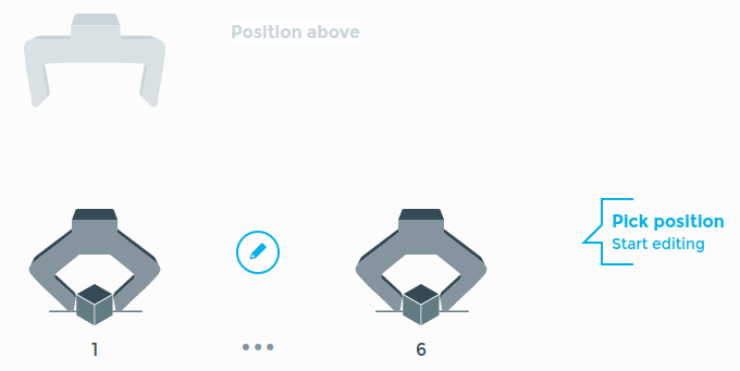
For the positioning of the steps inside the context menu it has to be taken into account to which pose (the first or the last) the non-reference poses are relative. In the image above, the Position above is relative to the first taught reference pose.
Pattern
In a pattern group, the dimensions of a pattern and three corners are
taught. The robot-pose will be replaced with a grid-widget, as depicted
in the following image.
The markup passed to the robot-pose has to be positioned to fit the corners,
i.e. the center of the image(s) has to be specified.
In our example, we add a [top] and [left] attribute to the .pose-content.
<robot-pose params="reference: true, ... ">
  <div class="pose-content" top="95px" left="65px">
    ...
  </div>
</robot-pose>
By default, the corners will be taught in the following order
top-left
top-right
bottom-right
By setting the parameter isBottomRightFirst to true, the order will change to
bottom-right
bottom-left
top-left
Linking
Parameters from different Apps can be linked - i.e. share the same configuration
- to enable e.g. to move to the identical position in two different Apps. To
enable custom components to link their handled parameters the attribute
[linkable] has to be added to the component in the App's clientData.
components : @{
  <component name="custom-component also-custom-component" linkable>
    <template src="custom_component.html"></template>
    <script src="custom_component.js"></script>
  </component>
}@
Furthermore, the component has to be registered with registerComponent from
the componentProviderApi, which has to be passed to the component from the
binding context. The following code line would register our custom-component
by providing the path of the source, which is provided in the component
constructor, the name of the component and a set of parameters.
params.componentProviderAPI.registerComponent(source.path, ["custom-component"], parameters)
If the component is unlinked a cloneConfiguration event is fired in the
componentProviderEvents from the componentProviderApi, which has to be
handled.
params.componentProviderAPI.componentProviderEvents.onCloneConfiguration(
  ...
)
In the following example, we handle the onCloneConfiguration event of a component which handles a pose. As two parameters from different Apps are linked, their accessPath points to the same configuration, e.g.
["parameter", "poses", 3, "pose"]
I.e. the pose is stored in the third poses entry of the source.
Note
Is the App inside a group, the accessPath is prefixed with one or more
"parent" items.
If the parameters are unlinked, we want to append a pose with the same configuration and change the access path of one of the former linked parameters to point to the new config.
Determine the number of parents by evaluating the paths of the source and the parameter
Get the index of the configuration from the access path of the parameter. As the index is the third item in the access path (without parents), we can obtain it by
numberOfParents + 2, as Lua indexing is one-based.Clone the configuration from the source
Determine the new index for the configuration, i.e. the number of poses in the source
Write the cloned configuration to the new index in the source
Those steps are depicted in the following code-block.
params.componentProviderAPI.componentProviderEvents.onCloneConfiguration(
  var numberOfParents = (parameter.path().indices.length - source.path().indices.length) - 2
  var index = parameter.access[numberOfParents + 2]
  var config = _.cloneDeep(source.parameter("poses")()[index])
  var newIndex = this.source.parameter("poses")().length
  this.source.parameter(["poses", newIndex])(config)
)